Basic Color Theory for Photographers
As photographers, we have a lot of tools available to us: compositional rules, lighting knowledge, the exposure triangle, and so on. Color is just another one of those tools. While it can be an intimidating element to a photographer, color can help solidify a voice. Knowing and understanding color theory the way painters, designers, and artists of all trades do, a photographer can utilize color to their benefit.
You may already be aware of the concept of additive and subtractive color (RGB vs. RYB), which is something we will touch upon in a future post. For the sake of this lesson, we will be talking in generics about color theory and are focusing on Red Yellow Blue (RYB).
We will look at orders of colors, variables of colors, and color schemes. By the end, you should be able to recognize different color orders and schemes, and how to use variables to bring out the most in your images.
Orders of Colors
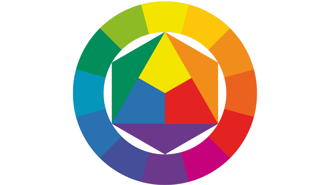
This may cause some flashbacks to elementary school art class, but let's start at the beginning: the orders of colors. There are three orders: Primary, Secondary, and Tertiary colors.
Click each 'i' to learn more.
When working in RYB color, the primary colors are red, yellow, and blue. They are the three pure colors from which all other colors are derived.
They are the starting point for every other color on the wheel.
A 50/50 combination of any two primary colors produces a secondary color.
Red + Yellow = Orange. Yellow + Blue = Green. Blue + Red = Violet.
A tertiary color is a combination of a primary and a secondary color, a 25/75 or 75/25 mix.
Example: Blue + Green = Turquoise.
When working in RYB color, the primary colors are red, yellow, and blue. They are the three pure colors from which all other colors are derived. If we take two primary colors and combine them equally, we get a secondary color. A tertiary color is one which is a combination of a primary and secondary color.
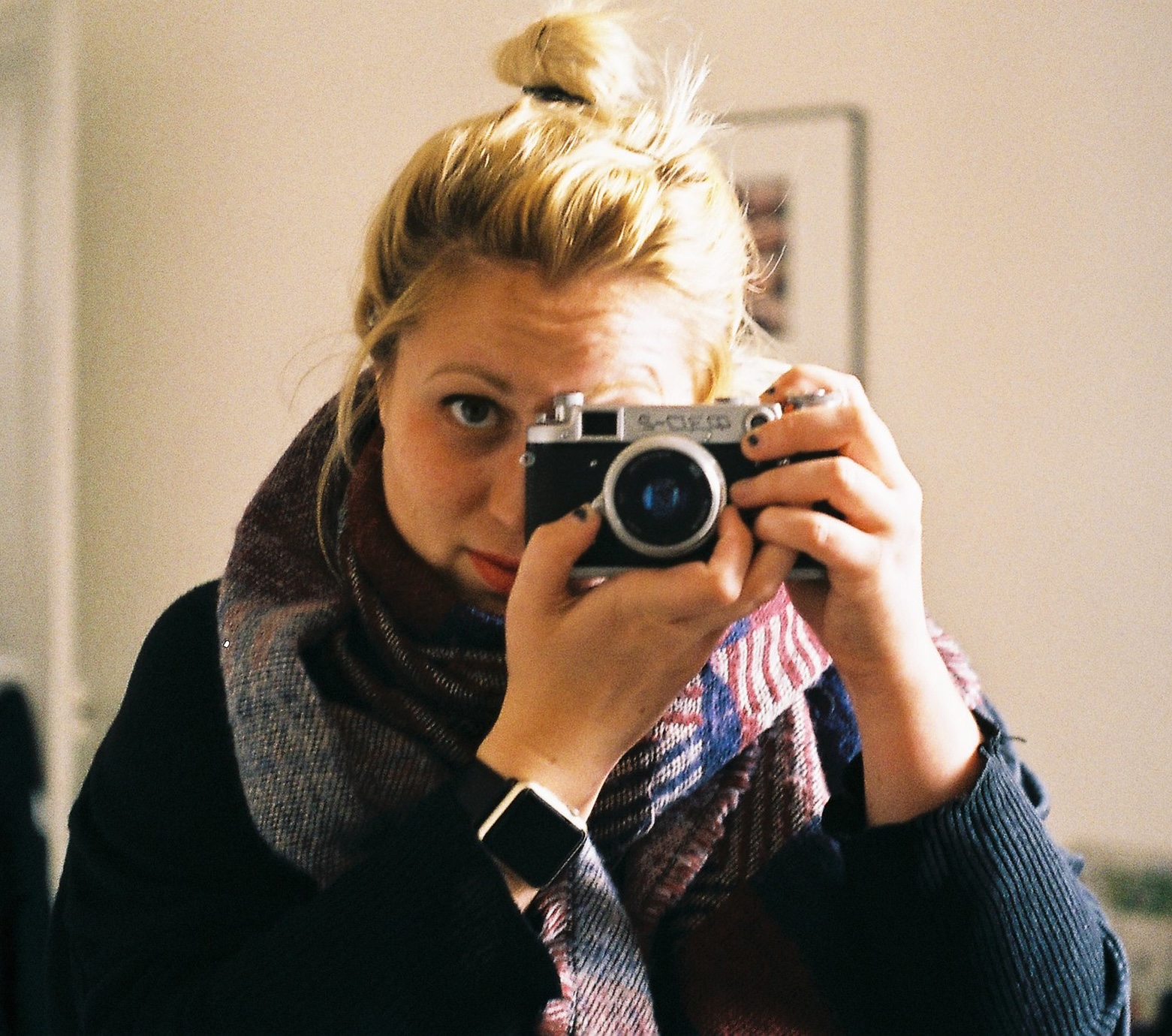
By knowing the three orders, we can make decisions about which colors we want to show in frame. Let's look at some examples of the three orders in actual photographs.
Variables of Colors
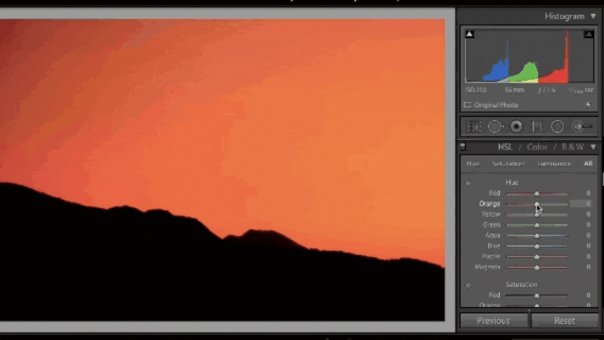
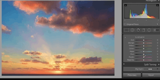
Now that we have been introduced to the orders of the colors, let's look at their variables. Those who have post processed images in Adobe Lightroom, Apple Photos, Capture One, or any other RAW editor may be familiar with what is commonly known as the HSL sliders: Hue, Saturation, and Luminosity.
Hue
Hue simply is the shade or name of the color. In our editing programs, this slider allows us to completely change a color.
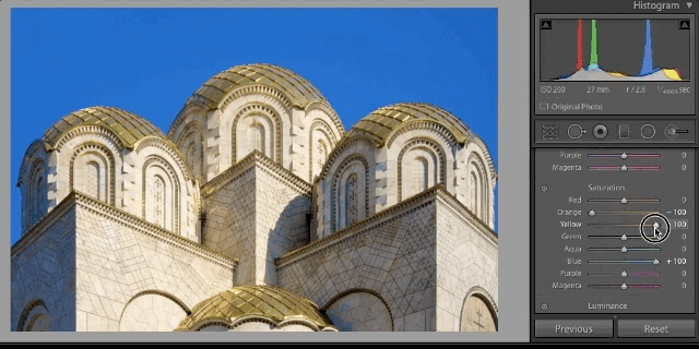
Saturation
Saturation is the amount of color, or its intensity. This is how we end up with those selective color photos we all... er... love so much, but it can also be used to isolate the strength of one color over the others.
Luminance
Luminance is the brightness of the color. This helps us bring out bright color, recover skin tones, and many other techniques.
Color Schemes
When you decorate a house, you choose the color of the walls to go with the furniture, wall hangings, curtains, and so on. You are essentially creating a color scheme. We do the same thing when we set up a shot. When being intentional with the color in your images, scheme absolutely comes into play.
Three of the most popular color schemes are complementary, analogous, and monochrome. To look at each individually, it helps to revisit our RYB color wheel.
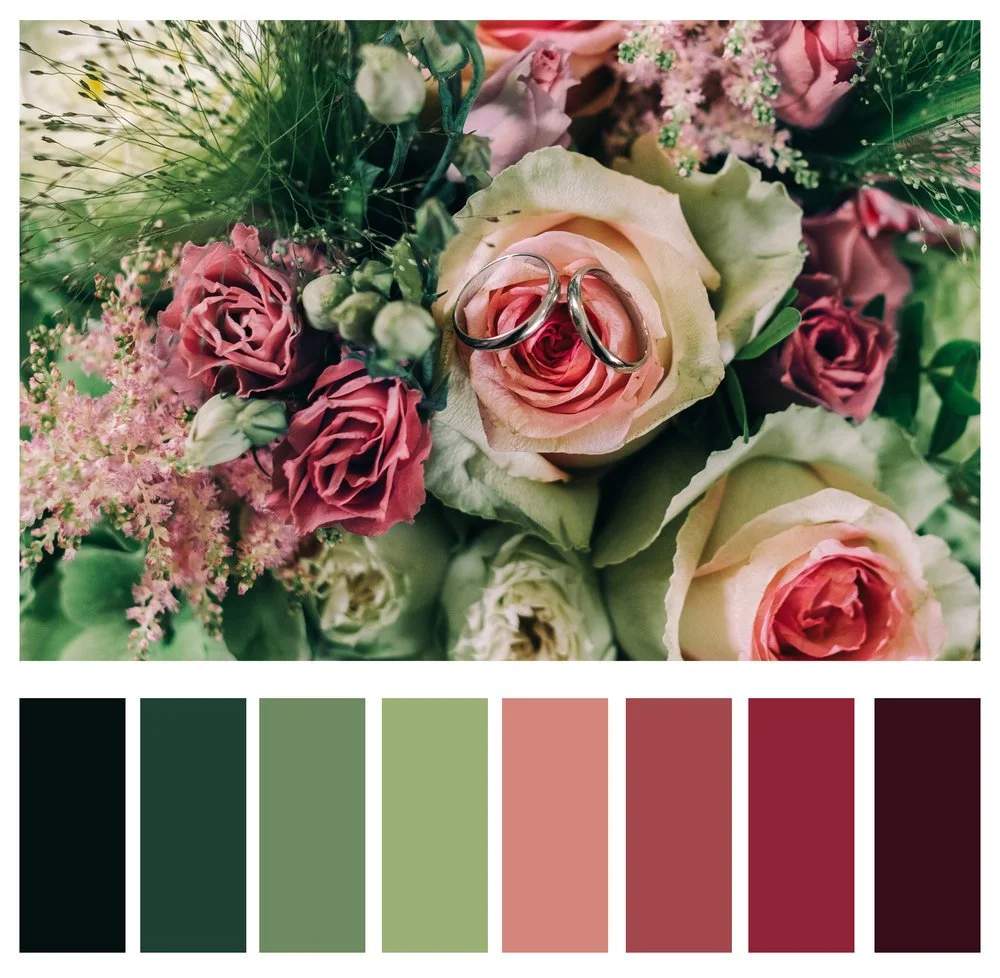
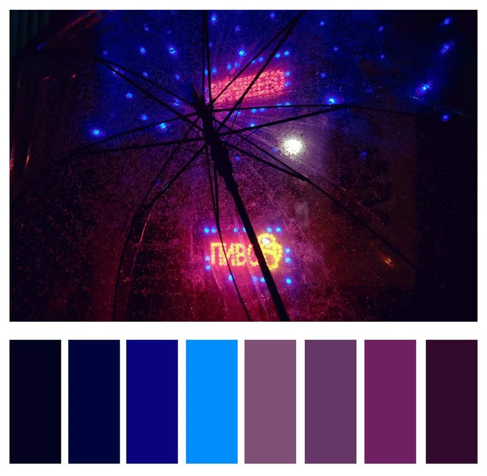
Complementary Colors
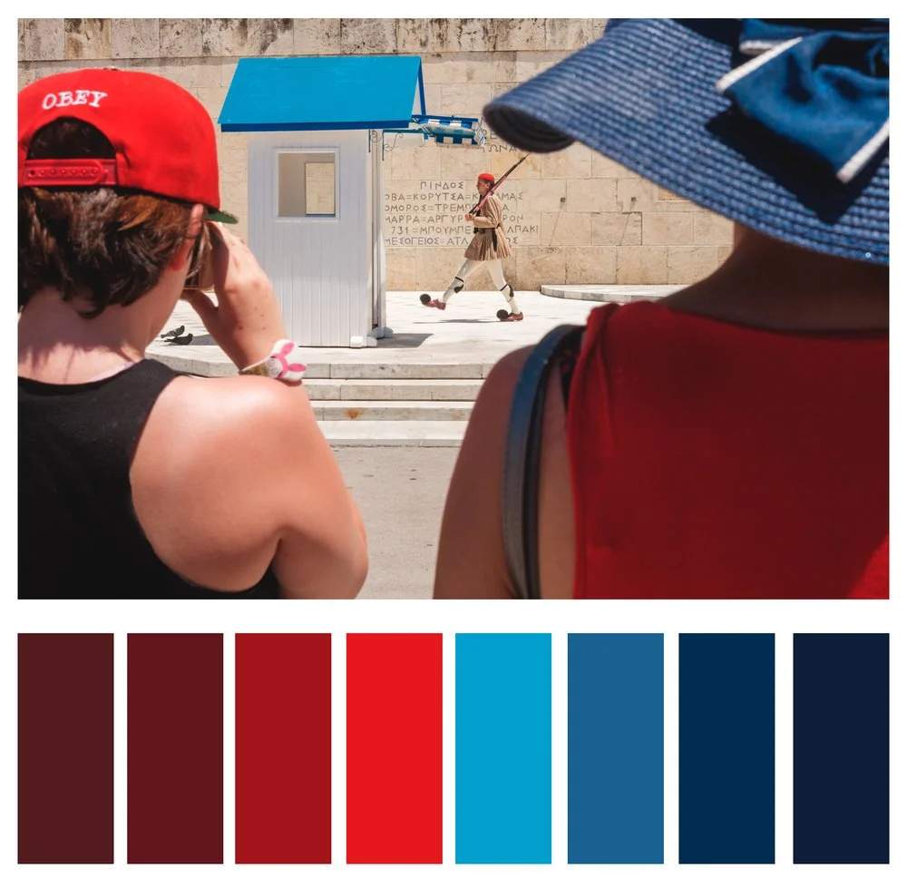
Simply put, complementary colors are the ones which sit completely opposite one another on the color wheel, and they, ahem, complement one another. For example, red and green may make you think of Christmas, or light blue and orange may make you think of the Mets (oh, only me?). But there's a reason these combinations create such strong emotions in us. They just look good together.
Note how attention is not being fought for by strong colors, but rather the colors create balance.
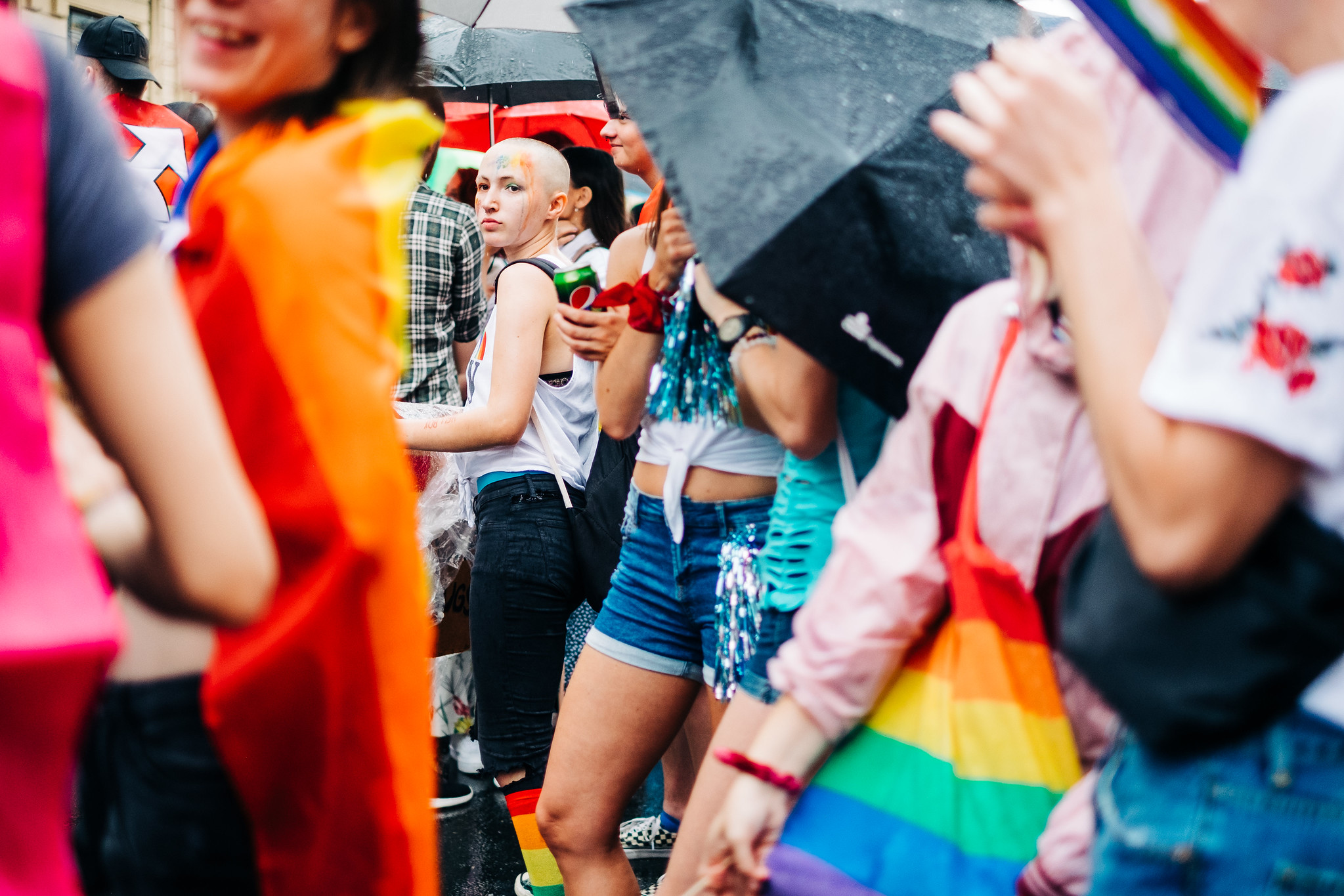
Below are a few images which utilize complementary colors.
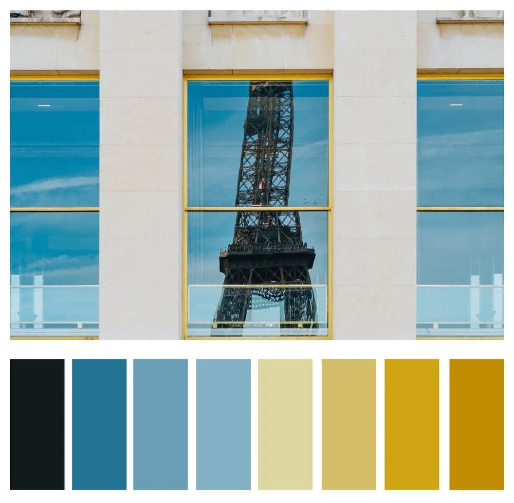
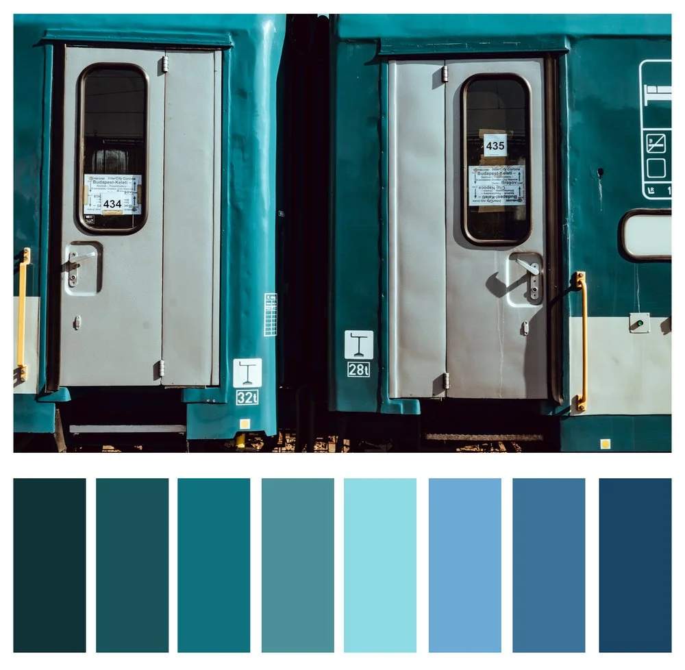
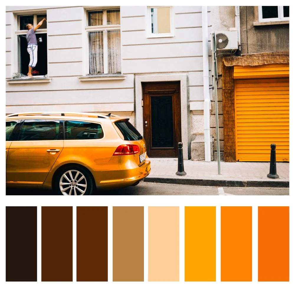
Analogous Colors
Colors which sit next to each other on the color wheel and share similar colors are known as analogous colors. They will have one dominant color in common, most often a primary color, but can also be a secondary or tertiary.
Analogous colors are often found in nature. Think those rich oranges and yellows in a New England autumn. Landscape photographers can really benefit from knowingly utilizing analogous colors, but they also lend themselves to other aspects of photography, such as beautifully bokeh'd backgrounds of a portrait. By having similar colors in the background, the subject remains the focus.
Below are some examples of analogous colors in photographs.
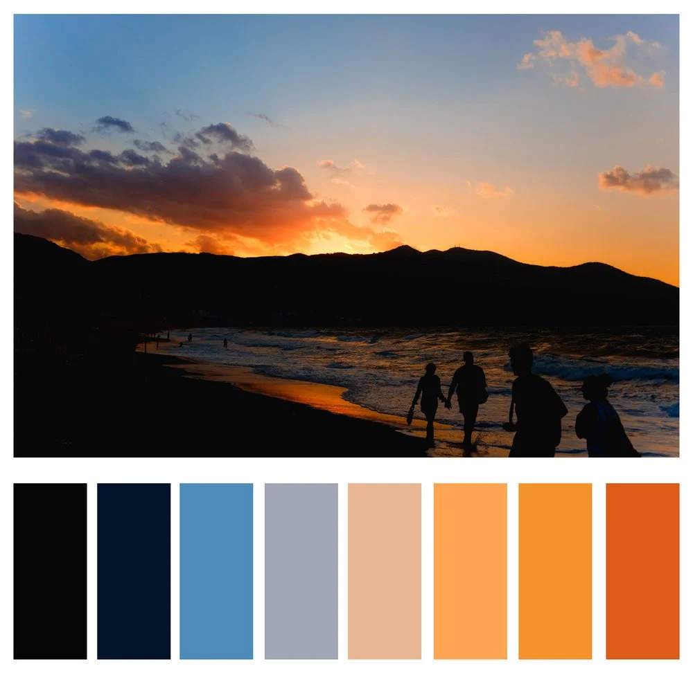
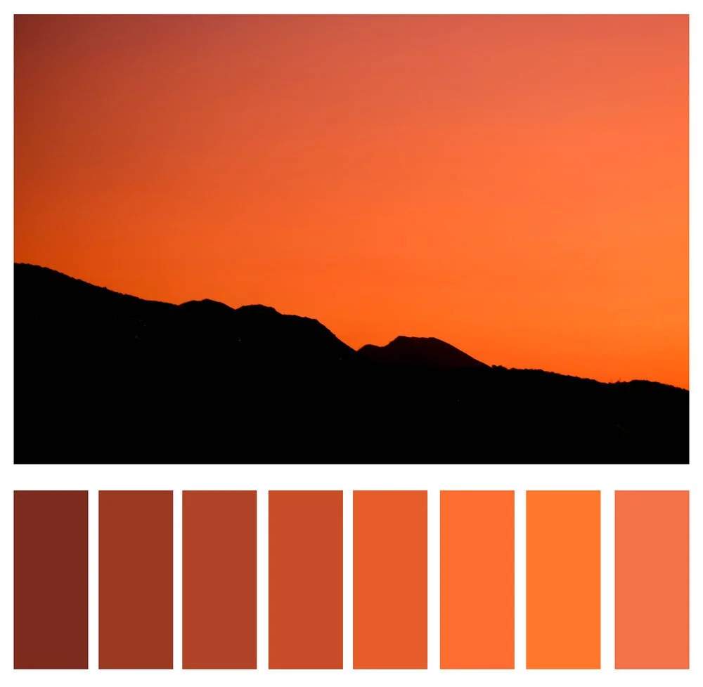
Monochrome Colors
While you may be familiar with monochrome referring to black and white, it actually refers to anything which uses solely one color value. Those images you see where there is overwhelmingly one color present are monochrome, for all intents and purposes. We see this technique often in those hazy sunrise/set shots, but it is also a very impactful technique for street shots.
Color Theory in Practice
So now we know the orders and variables, as well as three popular schemes of color, but how do those tools aid us in our photography? When we combine the three aspects, we can deliberately look for or create scenes that further our intended story.
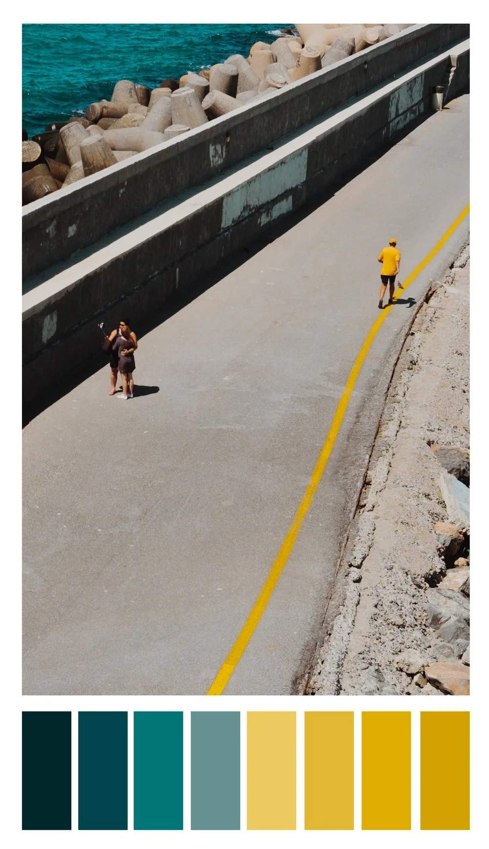
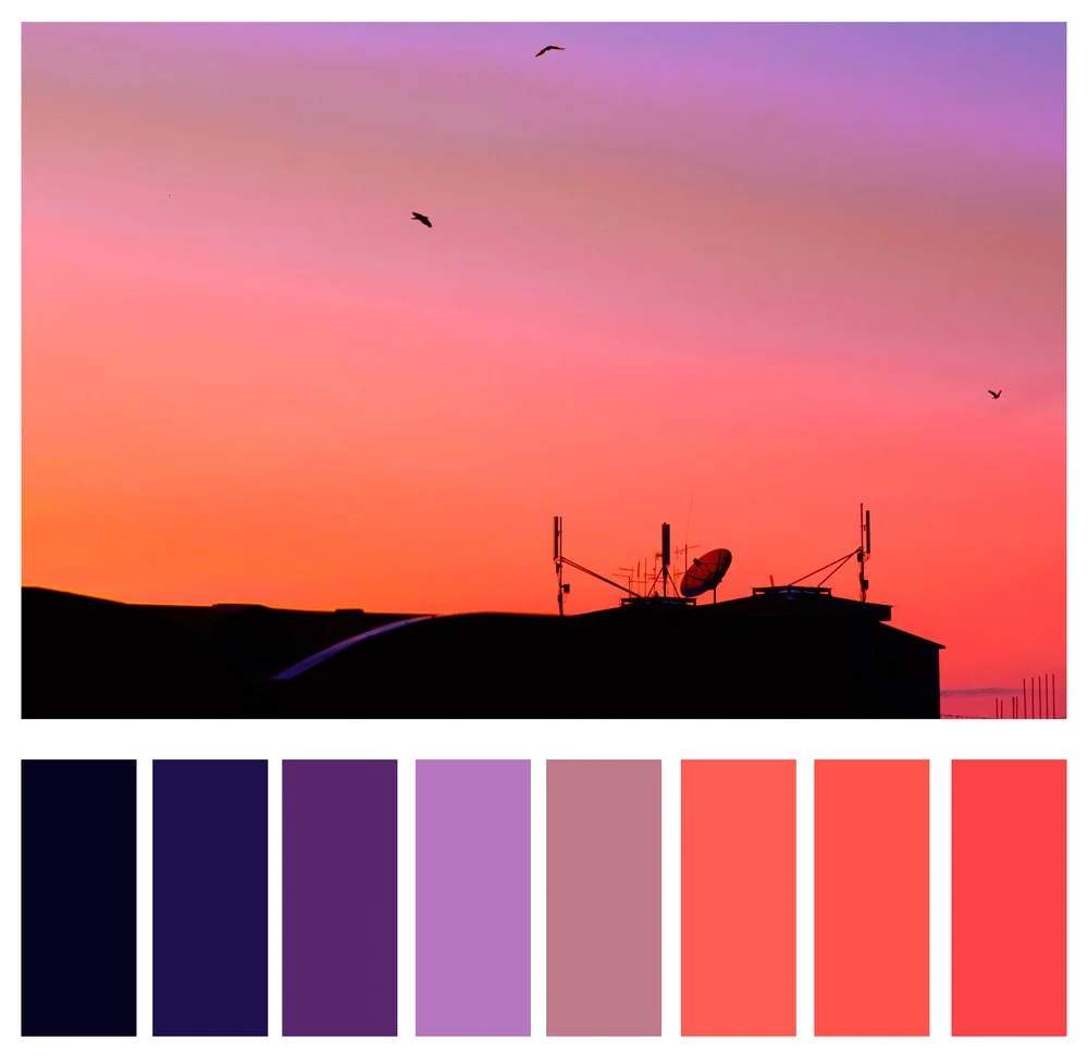
When I first approached this scene, I saw two things: interesting lines and complementary colors. With a little patience and a whole lot of luck, the jogger ran into the scene wearing one of the two complementary colors. Had this color story not been introduced, the image would have had much less impact. In this instance, the color creates the story.
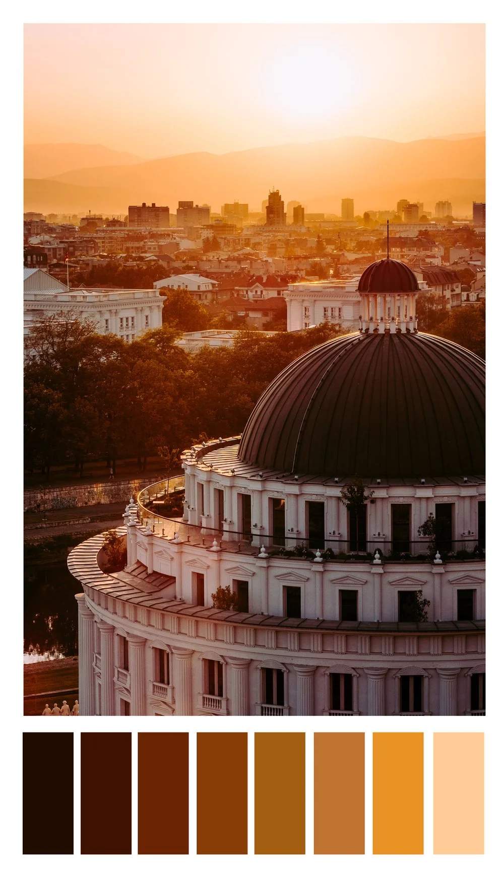
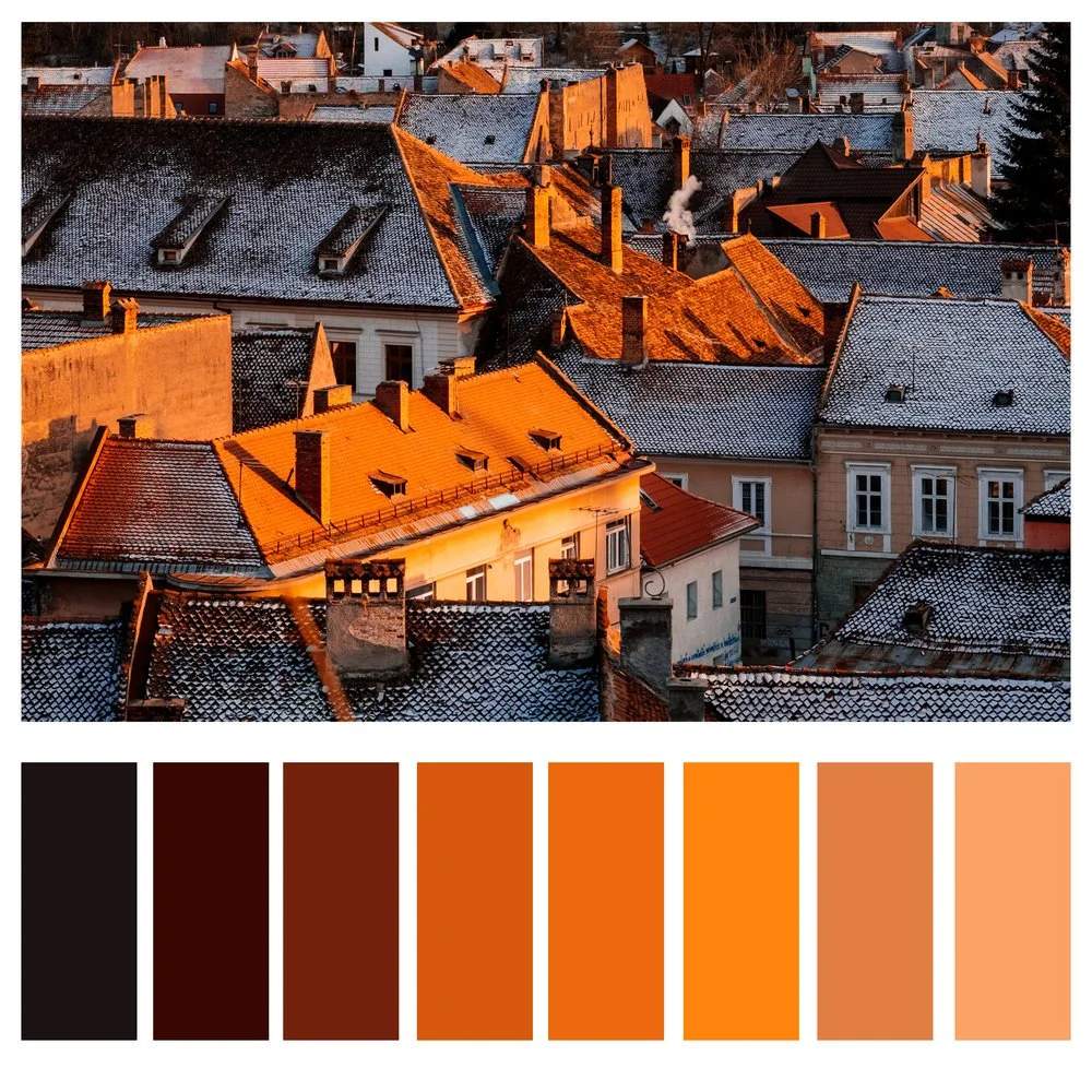
This photo utilizes monochrome in secondary colors. With a stark gradient from dark to light oranges, the image projects a warm summer's sunset, which is exactly what I was hoping to achieve as it was well over 105F (42C). Trying to capture that in a photo was an important part of the story of my time in that city.
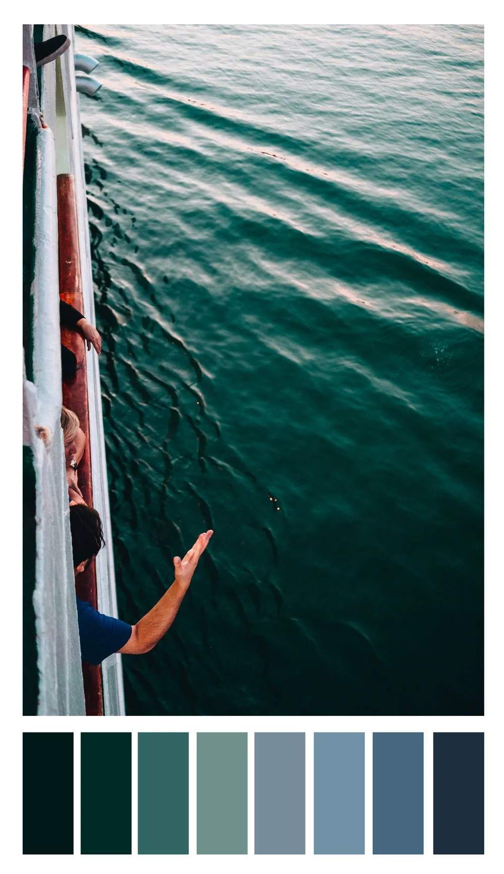
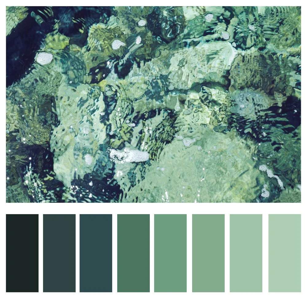
Here we see analogous tertiary colors. While the color is not so much the subject as it is in the other two, it is still crucial to set the mood for the shot. The various levels of greens and blues in the ocean water enhances the relaxed atmosphere I was intending to create with this image.
A note on color models: It is important to note that while RYB color is one with which we are all familiar, it is not the standard anymore. In fact, your photography software does not utilize RYB color by default. It uses a different, four color, subtractive color model known as CMYK (cyan, magenta, yellow, and key black). We stuck with RYB to keep it simple. In a future post, we will go deeper into color theory, as it is a rabbit hole.
In the meantime, an excellent resource for choosing colors is Adobe's color wheel. Here you can choose a color wheel and scheme and be given applicable pairings of colors. If not for nothing, it's fun and pretty to look at.