What's the visual narrative in this image?What is Visual Narrative?
For those like myself who went to film school, the phrase mise-en-scène is one which is burned into your brains. It often is presented in a convoluted way, creating an overinflated sense of complication. We’re not going to play that game. Simply, mise-en-scène is a just fancy (coughpretnetiouscough) way of saying everything that is visible in a frame. In French it means “putting in the scene.” If you’ve watched The Bear, Burnt, The Menu, or any of my other favorite chef-focused movies/shows, you may have heard the term “mise-en-place,” which means “put in place” and is used to express the organization of ingredients and tools before cooking. The idea with a photo (or film set) is the same. We want all our ingredients in place in order to tell the story.
We can break mise-en-scène down into five categories. Side note: one of these has been altered from their film counterpart to better-fit photography.
Setting
Decor
Lighting
Depth of Space
Personal Style/Aesthetics
What is the setting here? What clues in the image help you to understand the setting?Setting
In photography, "setting" refers to the environment or background in which a photo is taken. It includes everything that surrounds the main subject of the photo. For example, if you're taking a picture of a flower, the setting would include the garden or the landscape around the flower. A photo taken in a bustling city street will have a different setting than one taken in a serene natural landscape, and this difference will evoke different narratives for the viewer. Setting can refer to locale, but also time of day, month, year, et cetera.
The above image has some clues as to where and when the photo was taken. Look carefully at all the present elements, and try and figure out what the setting is.
Once you’ve made your own guesses, read the below explanation and compare it to the below description:
The image above has some clear setting cues. One, it's on a river. Two, the Charles Bridge and the church on the hill is are known iconic images of Prague. Additionally, the trees are green and lush, and the overall imagery shows a summer scene. What decor is present here? How do they help you to understand the image's story?Decor
Decor refers to the visual elements within the scene that contribute to the overall aesthetic and atmosphere of the image, and helps to make the story more clear to the viewer. This includes background elements such as furniture, objects, textures, and colors that are intentionally arranged or chosen to complement the subject of the photograph. For example, in a portrait, the decor might include a carefully selected backdrop, props, or furniture that enhance the mood or tell a story about the person being photographed.
Look at the decor in the above image. What does it tell you about the story of the image. Think about: where is it? When is it? What is happening?
Once you’ve made your own guesses, read the below explanation and compare it to the below description:
Taken during early COVID at a grocery store in the Czech Republic. Clues include: the conveyer belt and food (grocery store), text in the posters (Czech language), COVID (face masks and gloves on the attendant).How does the lighting in this image effect it’s overall perception or feeling?Lighting
Just as a storyteller uses words to set the scene and convey emotions, lighting in photography helps tell a story by highlighting certain elements, creating shadows for depth, or evoking a particular feeling. For instance, imagine a photo of a dark alleyway with a single streetlight casting a mysterious glow. The lighting sets a mood of suspense or intrigue, suggesting a story of a late-night adventure or a secret meeting. Similarly, in a bright, well-lit portrait, the lighting might convey a sense of happiness, warmth, or positivity, telling the viewer something about the subject's personality or the mood of the moment.
Look at the lighting in the above image. What does it tell you about the story of the image. Think about: how does it effect the atmosphere or overall feeling of the story?
Once you’ve made your own guesses, read the below explanation and compare it to the below description:
The warm harsh light coming from the right of the frame elicits a feeling of a warm (or hot) summer day. The position of the sun lets us know that it was taken in the later afternoon. Compare this to the same scene taken midday or in the morning? How would the lighting change and how would that change the overall feeling of the image?Study the layering in this image. How does it make you, the viewer, interpret the scene?Depth of Space
When framing your scene, consider how the end-viewer will see it - what are you including that is important, and what are you excluding? A key element to immersing a viewer in your image is to show them how you are seeing things. Building depth is an enormously powerful tool when trying to immerse a viewer. In film, a common tactic is known as ‘over the shoulder’ shots.
In OTS shots, the camera is placed in a way where the viewer is literally looking past one figure in order to focus in on the main figure. You see this a lot in conversations. Showing both people in the conversation lets the viewer know that the speaker isn’t alone. By getting in close, you’re making the viewer feel like they are right there, practically in the conversation themselves. Layering elements gives the viewer the feeling of involvement, making your story easier to consume.
Once you’ve made your own guesses, read the below explanation and compare it to the below description:
Taken as an over the shoulder shot, this image puts the viewer close in the scene to elicit a feeling of actually being there. Had the image been taken from farther away, the point of view would be more of one from a passing viewer, not someone involved in the scene. The layering elements also make the market seem busy, crowded, and vast. From further away, the market may be more bare. How do you find your own voice?Personal Style and Aesthetics
Talking about personal style gets intimidating very quickly, especially when you’re on the imposter syndrome side of the spectrum. Two things I want to hit home here: 1. personal style evolves, and 2. the personal style in an image may not be your own, but your subject’s.
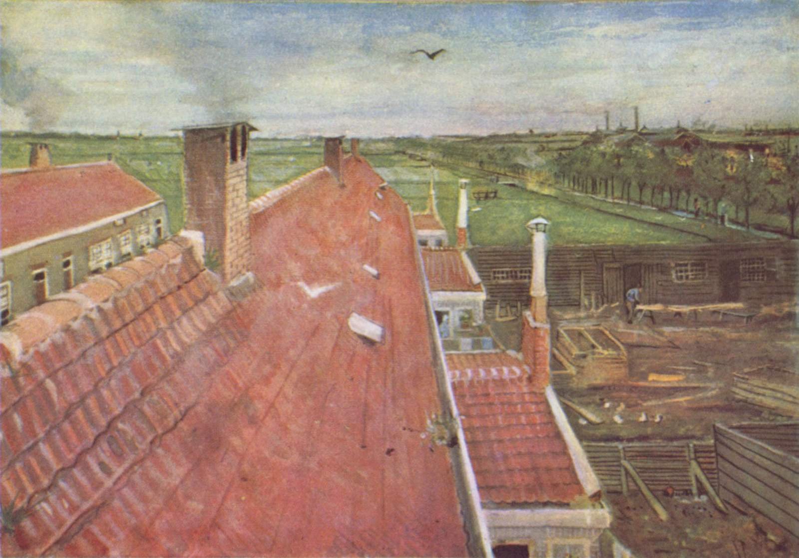
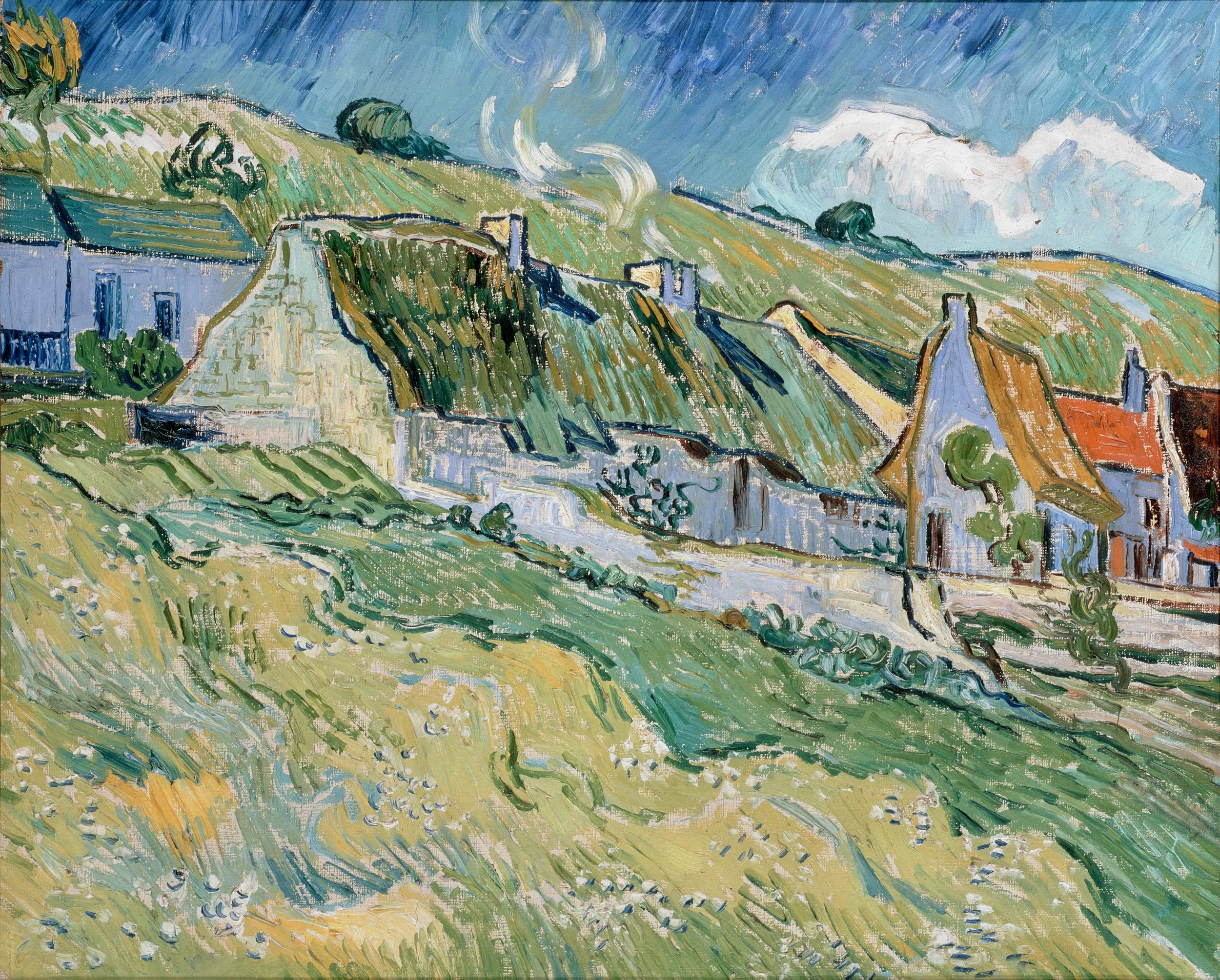
The first is that personal style is not static, nor is it based in subject, color grading, or any post processing. Personal style comes with time, and is ever evolving. Think about Van Gogh for a moment. His earlier work and later work are wildly different, but there are some common elements which you can see progress through his body of work that makes them distinctly his.
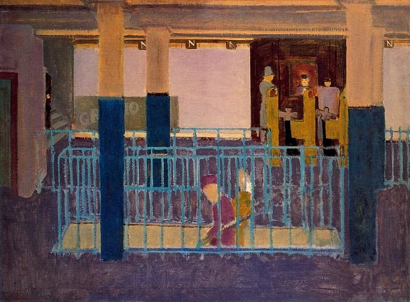
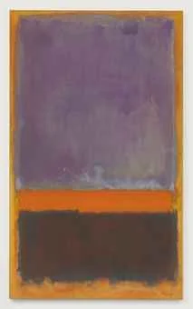
Rooftops, View from the Atelier The Hague (1882), watercolor, Private collection.Thatched Cottages and Houses (1890)What similarities can you see in this early work to the later one? Look at all his works in succession, do you see an evolution?(For those interested, you can read more about Van Gogh’s evolution here on My Modern Met.)Same goes for someone like Mark Rothko whose earlier works seem entirely unrelated to his later. But, look at these two images side by side, are there any commonalities? I’d argue that his evolution to large-scale color blocking/gradations was already apparent. Look at the lines and of the subway staircase and poles, notice how they’re similar to the lines in the later work.
Entrance to Subway (1938)Untitled (1952)When analyzing your own work, think about how you approach your images - is there a common technique you use often? Maybe you prefer to work under specific lighting conditions? For me, I know I lean heavily on strong foreground elements, usually out of focus. When looking at my photos as a ‘body of work,’ that obsession becomes quite apparent.
Whether you’re keen on art history or not, the point is just: don’t be discouraged by the idea that you need to have your personal style nailed down. It will continue to evolve naturally. If you’re very concerned about being able to identify a personal style now, just ask yourself about your process and final images. Where are the similarities?
Circling back to point two, personal style in terms of mise-en-scène may not be exclusively yours. If you’re working with a portrait subject, you also want to showcase their personal style. Pay attention to their styling, how they carry themselves, and what they are trying to evoke and incorporate your own skills and style to accentuate who they are. We’ll look more at this in terms specific to portraiture later on in the course.


